| Hello fellow contributors! Let us discuss all that needs discussing here, unless it be more specialized.
Some mini-rules:
|
I am re-sorting the issues/sections of this discussion-page, to have the more recent ones first. --Aleonymous (talk) 08:07, 15 April 2014 (UTC)
Visitor Statistics[]
Hello all. I was curious: Do we have access to the site's statistical data, e.g. number of unique visitors, page-hits, most-visited articles, countries-of-visitors etc? That would be interesting to have, in order to gauge which direction to expand the wiki to. The "Hydralytics" special page provides some information, but I can't filter it to get anything useful. For instance, it tells that the site has got zero views for a whole month or something; that's weird... --Aleonymous (talk) 09:58, 22 April 2014 (UTC)
- Heyo, just seeing this. If you still are looking send me an email bthomas@curse.com and I can give you some details. --Z3ther (talk) 14:48, 25 June 2015 (UTC)
Suggestion(s) about Front Page[]
I got a couple of suggestions:
- What if we moved the "Media->Screenshots/ConceptArt/Videos/FanArt" column out of both the "Saga" & "Factions" boxes, and merged it with the "Videos" box? In this way, the bottom-right box would be labeled "Media" and include these categories, while the boxes of Saga & Factions would be somewhat lightened.
- Shouldn't we place a button directly-linking to the "Buy Now" stoic-site page ( http://stoicstudio.com/buy-now/ ) for Saga, and to the "Steam-Store" page for Factions ?
What do you think? --Aleonymous (talk) 16:16, 8 April 2014 (UTC)
- Sounds good to me! -Guðmundr (Talk) 19:47, 8 April 2014 (UTC)
- Ok, I will try to "draft" something in my user-page, and show it to you, to tweak it, before we proceed --Aleonymous (talk)
- Made a draft for the front page on my user page. Still thinking about the best place/look for a "Buy Now" button, so haven't included that yet. Not sure about the grid view images I added from Steam. Any thoughts? -Guðmundr (Talk) 02:56, 9 April 2014 (UTC)
- Nice going! I like the idea of the Steam-grid-images for the two games, but I agree that "we not quite there yet". Saga's image kinda duplicates the YouTube trailer video snapshot. One idea would be to have the steam-grid-images smaller, and floating on the right or left; they (and/or their captions) could be linked to the "Buy" pages... Also, what if we had Saga & Factions boxes side-by-side, and below them the trailer & media boxes? Hmmm, yeah, one would like to have the video up first... --Aleonymous (talk) 06:47, 9 April 2014 (UTC)
- Okay, made some more changes. Added the "buy now" and "play now" buttons, and positioned the grid view images differently. How does it look? I'm not sure we should move the sections around, I think having the Banner Saga and the Launch Trailer boxes at the top works well. -Guðmundr (Talk) 20:43, 10 April 2014 (UTC)
- Neat! The steam-images and the "Buy/Play Now" buttons are really helping the eye there. Did you "offset" (horizontally, to the left) the Titles of the "Saga" & "Factions" boxes intentionally, or did the "Now" buttons cause that? Adding Music section in the "Media" box was a nice idea, but the column-widths need equalization. Apart from those small "alignment" issues, the page is ready to go up front :) Thanks Gud --Aleonymous (talk) 07:37, 11 April 2014 (UTC)
- Gud, why don't you transfer the changes from your userpage to the front-page? To get the "media" and "trailer" boxes to equal width (and so too, for Saga & Factions boxes), I'd split the "media" box in four sub-boxes, i.e. VidsSaga & VidsFactions (top row) and Images & Music (bottom row) --Aleonymous (talk) 08:07, 15 April 2014 (UTC)
- Thanks Aleo. I wasn't sure if the trailer and media boxes should be equal width, cause it appears as though the trailer cannot be resized, and making the media box the width of the trailer really squeezes the media box too much (at least on my monitor, 1366x768). I'll go ahead and put the current version on the main page, but feel free to mess around with it. -Guðmundr (Talk) 16:09, 15 April 2014 (UTC)
- Gud, why don't you transfer the changes from your userpage to the front-page? To get the "media" and "trailer" boxes to equal width (and so too, for Saga & Factions boxes), I'd split the "media" box in four sub-boxes, i.e. VidsSaga & VidsFactions (top row) and Images & Music (bottom row) --Aleonymous (talk) 08:07, 15 April 2014 (UTC)
- Neat! The steam-images and the "Buy/Play Now" buttons are really helping the eye there. Did you "offset" (horizontally, to the left) the Titles of the "Saga" & "Factions" boxes intentionally, or did the "Now" buttons cause that? Adding Music section in the "Media" box was a nice idea, but the column-widths need equalization. Apart from those small "alignment" issues, the page is ready to go up front :) Thanks Gud --Aleonymous (talk) 07:37, 11 April 2014 (UTC)
- Okay, made some more changes. Added the "buy now" and "play now" buttons, and positioned the grid view images differently. How does it look? I'm not sure we should move the sections around, I think having the Banner Saga and the Launch Trailer boxes at the top works well. -Guðmundr (Talk) 20:43, 10 April 2014 (UTC)
- Nice going! I like the idea of the Steam-grid-images for the two games, but I agree that "we not quite there yet". Saga's image kinda duplicates the YouTube trailer video snapshot. One idea would be to have the steam-grid-images smaller, and floating on the right or left; they (and/or their captions) could be linked to the "Buy" pages... Also, what if we had Saga & Factions boxes side-by-side, and below them the trailer & media boxes? Hmmm, yeah, one would like to have the video up first... --Aleonymous (talk) 06:47, 9 April 2014 (UTC)
- Made a draft for the front page on my user page. Still thinking about the best place/look for a "Buy Now" button, so haven't included that yet. Not sure about the grid view images I added from Steam. Any thoughts? -Guðmundr (Talk) 02:56, 9 April 2014 (UTC)
(Went back to the left margin cuz this was pulling too long!) Yes, I noticed this weird white-background horizontal-stripe. I am not really sure what might be causing this. However, looking at the page-code, I see that there's some "stray" (termination markups, for table-rows), that don't seem to pair well... I am no HTML expert, but I see how things tend to get messed up in these tables-within-tables :) There's also this "PortalContents" template, that's actually one more table! Anyway, I am gonna do some tests on my user-page too, and see what I can come up with. --Aleonymous (talk) 18:45, 15 April 2014 (UTC)
- Love what you guys did with the front page, it's starting to look really quite good these days. I think in the near future we're going to have to address the second + additional parts that are currently in development now that the whole cc lawsuit is settled... --Z3ther (talk) 00:10, 18 April 2014 (UTC)
Recording Events of TBS#1[]
Hey fellas, how's it going? So I've been doing some thinking and have a few suggestions for layout before we go nuts here. In the Characters section, we're setting up links to individual chapters within Part 1. So the questions are...
1) Do we want to have one large article of the events of The Banner Saga: Part 1?
2) Or do we prefer articles set aside for each, individual chapter?
3) Both, with the over-arcing article linking to individual chapters for greater details and to handle story branching?
I'm okay with whatever you guys want to do, but I think some central planning now can save us excess work later. --Helmdr (talk) 00:00, 4 February 2014 (UTC)
- Hello Helmdr! I would personally go for option (1), unless someone wants to undertake the laborious task of doing (2) or (3). As the story is not so clear, yet, I think that a small resume of the basic events of each chapter would suffice. Of course, if anyone is up to exploring all the different story-branches (especially related with characters joining/leaving the part), why would I mind :)
- --Aleonymous (talk) 09:21, 4 February 2014 (UTC)
- Hey hey hey. Anyway, I'm perfectly content going with choice 1 unless we feel it grows too large. --Helmdr (talk) 18:00, 4 February 2014 (UTC)
- Go go go, then, Helmdr! :) We'll keep a watchful eye, and try to contribute --Aleonymous (talk) 22:33, 4 February 2014 (UTC)
- A bare bones breakdown of The Banner Saga: Part 1 has been added. You can update the links by going [[The Banner Saga: Part 1#Chapter 4]] where you just change the 4 to whatever chapter you want. --Helmdr (talk) 20:58, 5 February 2014 (UTC)
Site-admins, can we change the front page such that Chapters directs to The Banner Saga: Part 1 please? --Helmdr (talk) 21:38, 17 February 2014 (UTC)
Background Texture[]
I was thinking that this texture from the main site would look good as the page background (to replace the white grungy background, rather than the map background). I couldn't figure out how to change it to try it out though.
Also, is it possible to change the wiki's logo? I was thinking it might look better if the word "wiki" was in the typeface Vinque which is used frequently throughout the game. Here's a mockup of what I had in mind:
Gudmundr (talk) 22:32, 20 January 2014 (UTC)
- Hey Gudmundr! Thanks a bunch for changing the logo, that looks much better. I went and changed the css with the background (inside the map to the texture that it's now, but we can change it again if that's what you were thinking... It was just a simple white and pretty boring so I changed it out.. If you have it fixed already then I won't worry, but let me know if you want.
- By the way, if you want to make any changes to css, and aren't really sure what you're doing, copy to your username's css and make any changes you want without it going global.--Z3ther (talk) 19:32, 21 January 2014 (UTC)
- Thanks, I'll make sure and test out any future changes to the css on my username's css page.
- I was also contemplating the possibility of making the skin of this wiki more similar to the main Stoic site (predominantly white, with red and dark grey accents, using the background texture that I've already applied to the wiki), in order to achieve more visual unity between the two sites. Any thoughts? Gudmundr (talk) 00:14, 22 January 2014 (UTC)
Hey all (and specifically Gudmundr). Here's some questions/suggestions:
- I recently modified the background image (the map): I applied a dark gradient on the left, to make the navigation menu (in white color fonts) more visible; more contrast. What do you think?
- About the texture you suggested for the background, I am OK with that too. Do make the change so that we can see how it feels. Will using that texture-file you posted above "automatically tile" itself to fill the background? One of my problems is that its very low-contrast. I barely noticed it in the main site. Perhaps some sharpening?
- About the wiki's logo: I think the image scale-down (from the prototype you posted above) produces some aliasing. What do you think? Maybe doing the scale-down manually and uploading the corrected version will correct this.
Thanks--Aleonymous (talk) 23:40, 1 February 2014 (UTC)
- Hey Gud. The new version of the scaled-down logo is indeed better. Also, the "Stoic background" looks better at this contrast-level. On small note: you arranged it in order to be "packed/tiled" in a rectangular-grid, whereas the "proper" way is for it to be "packed/tiled" in a hex-like-grid. I will try and do some re-arrangement of the image (tomorrow), so that it "packs/tiles" as it should. Thanks again! --Aleonymous (talk) 23:20, 2 February 2014 (UTC)
[]
8-June-2013 // Can the site-admin do something about the font-colors on the Navigation bar (on the left)? The color of the links already visited is dark blue which is very badly visible against the black background. Thanks!
- Could you provide a screenshot? i've visited all the links and they look fine to me, but it's possible that the issue is browser-specific or that i misunderstand your request. In either case, a screenshot would help clear that up and then i can make any necessary changes — Game widow (talk) 12:43, 8 June 2013 (UTC)
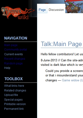 Here it is -- Aleonymous (talk) 15:55, 8 June 2013 (UTC)
- Thanks for the screenshot, that's definitely not what i see, but i'll fix it. Which browser do you use, btw? — Game widow (talk) 17:45, 10 June 2013 (UTC)
I use Firefox (v21). Its all seems better now and the visited links do not change color (to that deep blue). I hope it won't reappear after I reboot etc (I tried close/open the browser and all links stayed in their default sky-blue color). Thanks GW (=Game Widow)! --Aleonymous (talk) 19:27, 10 June 2013 (UTC)
Сезонная ликвидация оптового склада. Мужские механические деловые часы WEIGUAN по реальным ценам![]
В связи с ликвидацией часового подразделения фирмы - СУПЕР ПРЕДЛОЖЕНИЕ - http://weiguan.top10bestsellers.ru/?x - мужские механические брендовые часы WEIGUAN с часовым механизмом высшего класса с автоподзаводом
Эти дизайнерские часы ВЕГАН реальный хит года! Низкие цены. Ускоренная доставка. Гарантия настоящего качества!
Закажите часы ВЕГАН прямо сегодня - http://weiguan.top10bestsellers.ru/?x
^^^^^^^^^^^^^^^
Durch den Kamin schwul ficken![]
Asiatische Lesben und zwei Blondinen mit Alte Hausfrau mit harten Zitzen erwirbt aus an Diosa guapa chupa una polla gorda https://nur-xxx.com/nxv/PY1BDoMgFERPIzsMCDFuWJioO3sHq7RgFah8C_X0xTZp8jOZmUz-uwlGSsJLUqGnYJwhnwqOnKAELUIBOJ-xOiu6dKDkfXjno11TeOlJWp9MURWcsmSUBZAesLKrXIdJ4jTG46IdDhoUhqDNA6vBTLO9Yj9KIz0jpKzO56xzm11txhpKirJCSnCO9i__jw8h5Gbf8hjjj5-0P9p4meujb9rD1_W5RFLQDw Heißesten hausgemachte schwul Clip mit Twink, - Nur.XXX El primer pollГіn negro de una amateur Slutty Babe Proxy Paige ficken mit zwei Transen, Pelirroja soplapollas en acciГіn